Blog Entry 9162020
|
Exercise: Look at a magazine cover. What can you tell about the type of magazine it is; what kinds of articles it contains; who is likely to read it? Why? By simply looking at the magazine cover, I can tell that this magazine will include articles about current environmental issues and educational resources. Environmentalists, animal activists, and millennials are most likely to read this because they will express interest in environmental topics.
This exercise is likely to elicit responses which focus on:
|
Intertextuality is when one text makes reference to another either directly or indirectly.
There are different types of intertextuality. Indirect intertextuality is when there are traces of other pieces in a film or show, even if it is not directly mentioned. Direct/deliberate intertextuality is when the references are clearly visible and is a deliberate recreation of the style of another artist. The third type of intertextuality is accidental in which a piece has an unplanned correlation to another film or show whether it be in similar style of connotations.
There are different types of intertextuality. Indirect intertextuality is when there are traces of other pieces in a film or show, even if it is not directly mentioned. Direct/deliberate intertextuality is when the references are clearly visible and is a deliberate recreation of the style of another artist. The third type of intertextuality is accidental in which a piece has an unplanned correlation to another film or show whether it be in similar style of connotations.
|
|
|
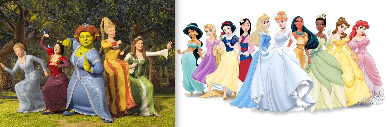
The first image shows hoe Shrek draws direct correlations between the princesses in the movie and Disney princesses. Even their dresses and overall aesthetic is similar but clearly done in the Shrek animation style and theme.
|
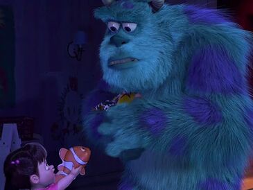
The second image from Monsters Inc. has a clearly placed Easter egg. It features a toy nemo that references back to the finding nemo movies.
|
|
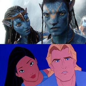
The third image shows the intertextuality in Avatar by comparing the similarities between the two main love interests. This is an interesting comparison because the male is the foreigner in both movies while the female character loves/saves her homeland.
|
Magazine Mockup and Write up |
|
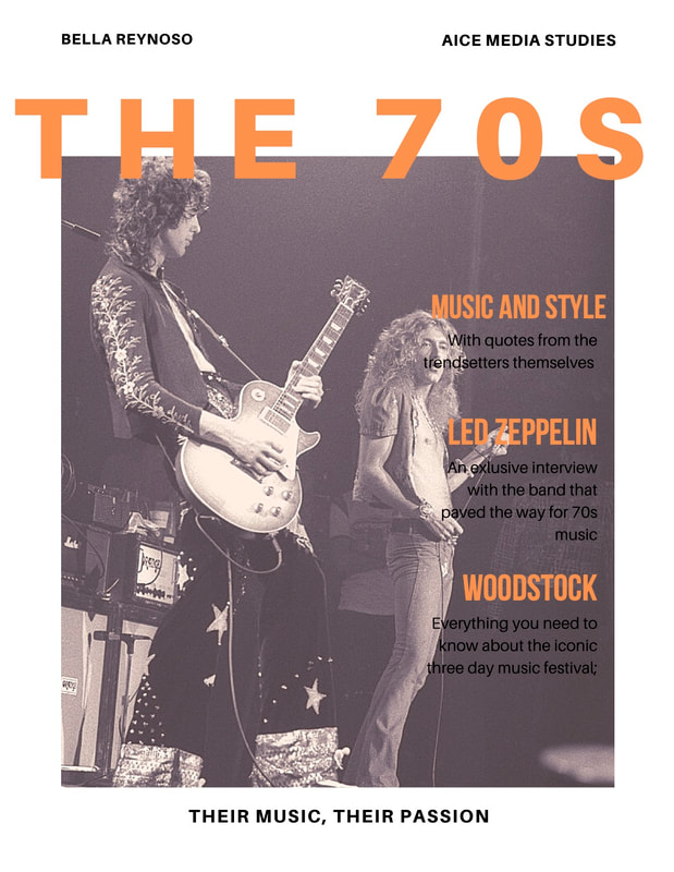
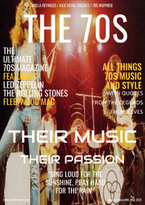
The title, "The 70s", is a literal implication of the era. I wanted to the reader to be struc by the very blunt , forward title, which suggest 70s music, style, and culture.
The style of the color scheme and font is big and bold. I wanted the magazine cover to have a modern reflection on the 70s. The indentation between "Their Music Their Passion" creates a dramatic effect and really draws interest to the artists. The goal of the text is to spark interest and curiosity towards the subject matter, this was achieved with the quote at the bottom and keywords like legends and ultimate. The image I selected is of Led Zeppelin performing. Led Zeppelin was one of the most influential bands of the 70s and still has relevance today. None of the members are making eye contact in the photo, as they are performing with passion. The lighting has orange hues to match the color of the text. They are dressed in vintage fashion and are holding their instruments. Like I previously mentioned, the strapline is Their Music Their Passion and put this in a more edgy font to draw attention to the words. Beneath it is a quote by Led Zeppelin in their hit song, Down by the Seaside. It is important to note that the magazine uses dramatic phrases and is not minimalistic, it is slightly busy and creates a fun and interesting read for the audience. It highlights the artists and makes vintage styles and old music more approachable and admirable. |
Fargo Notes Compare and Contrast
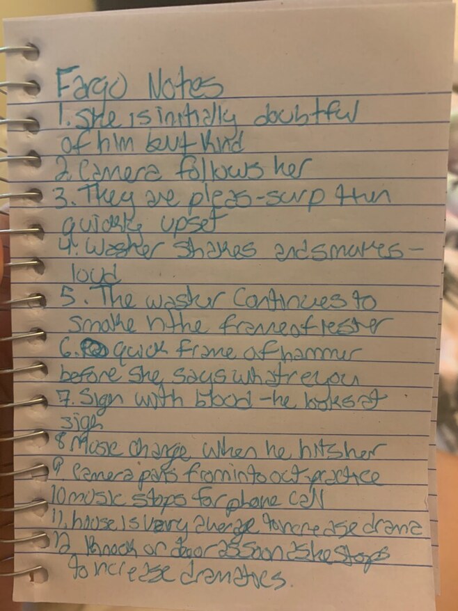
The next time I take notes on a piece, I will take the parts of the candidates notes that I like into consideration. The candidate organized their notes into themes and types of details, for example, camera, editing, mise-en-scene, and sound. I also based my notes off of these subjects and commented on the camera angles and audios, however, I organized my notes in chronological order because for my response I broke down the scene in the order of occurence. The candidates notes have shown me that i need to be more detailed in my notes, I think i did well noticing many aspects of the scene, however, I pointed out the setting and dark lighting, while the candidate commented on the dark furniture, tones of grey in the lighting, and the dull dark colored clothing. We both pointed out the zooming in and out to the signifigance of the scene as well as the camera shots changing to match the dialogue, Overall, I think I could have been much more detailed in my notes and more specific. However, after seeing a sample of a candidates notes, I have a better idea of the importance of organization and attention to detail.
Fargo response compare and contrast
|
The opening scenes of Fargo is fairly normal as it follows a middle aged women when she enters her house. We can assume that she is looking for her husband, as her first words are calling his name. The setting is fairly a fairly average American house with nothing of interest to look at. This keeps the audience focused on the plot and characters. The lighting is dim but well light enough to get a clear view of the characters. Initially, the camera is following the women and leads us to believe that the storyline may revolve around her.
As she enters the basement to meet her husband, we notice that the set is boring, dim, and more creepy than the rest of the house, that we have seen. Their dialogue is light as he explains that he is attempting to fix the washer machine. She is doubtful of him at first, which is foreshadowing her attitude towards him throughout their relationship. When they test the machine, the camera is zoomed into the washer as it shakes violently and creates an unsettling noise. The zooming in creates an even more dramatic effect for the audience. Their dialogue quickly changes. It is more aggressive and fast paced as they begin to argue. The camera pans back and forth from each character as they respond to one another. We get to see Lester's reactions as she speaks. As she asks him what he is going to do, the camera quickly pans to show the hammer sitting on a table, back to her, and then back to the hammer as Lester picks it up. This shows that Lester considered using the hammer and gives the audience some foreshadowing and a peek into Lesters though process. When he hits her and blood begins to drip down her face, the camera work and audio creates a dramatic effect for the audience. The sound in this scene is very slow, daunting music and the camera work is a still shot of her face with a blank expression as she has just been struck on te head. The music stops for the phone call that Lester makes, almost to turn the audience attention and create a more serious tone. We watch Lester search and find the gun and it givs the audience a sense of curiousity and suspense as we do not know his plan yet. The camera pans back and forth from two different angles, one inside the house as he closes the door and the other from outside, looking in to Lester holding the gun. This repetition, that shows Lester practicing this confrontation, creates suspense and drama for the audience. The clip cuts off when there is a knock on the door very shortly after he is done practicing. This creates tension, which we can sense in Lester. Overall, the mise-en-scene, editing, camera work, and audio, all works together to set the tone for the scene. We get a look into Lesters mind and actions as they presented in a thrilling, yet surprising way to the audience. |
In both the candidate and my response, we begin to describe the scene from beginning to end. The candidate, however, includes a brief introduction that summarizes the sequence, I will be sure to start off my response like this next time.
We both discuss the dim lighting and dullness of the opening scenes and the type of mood they bring as well as the attention that it attracts to the two main characters. The candidate also mentions the types of camera shots/angles that are used throughout the piece. As I comment on the camera panning back and forth, wide shots, and the effects of the zooming in and out of the characters and the washer, the candidate also comments on the medium long shots of the characters. On future responses, I will be sure to use more terminology to strengthen my points, just as they did. I think I did well mentioning how the lighting, sounds, and mise-en-scene drew in the audience. The candidates response was also longer than mine, I could have drawn in on more details that I may have overlooked. Having more detailed notes will help me to extend my descriptions in the future. |
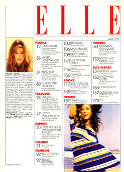
TOC Layouts
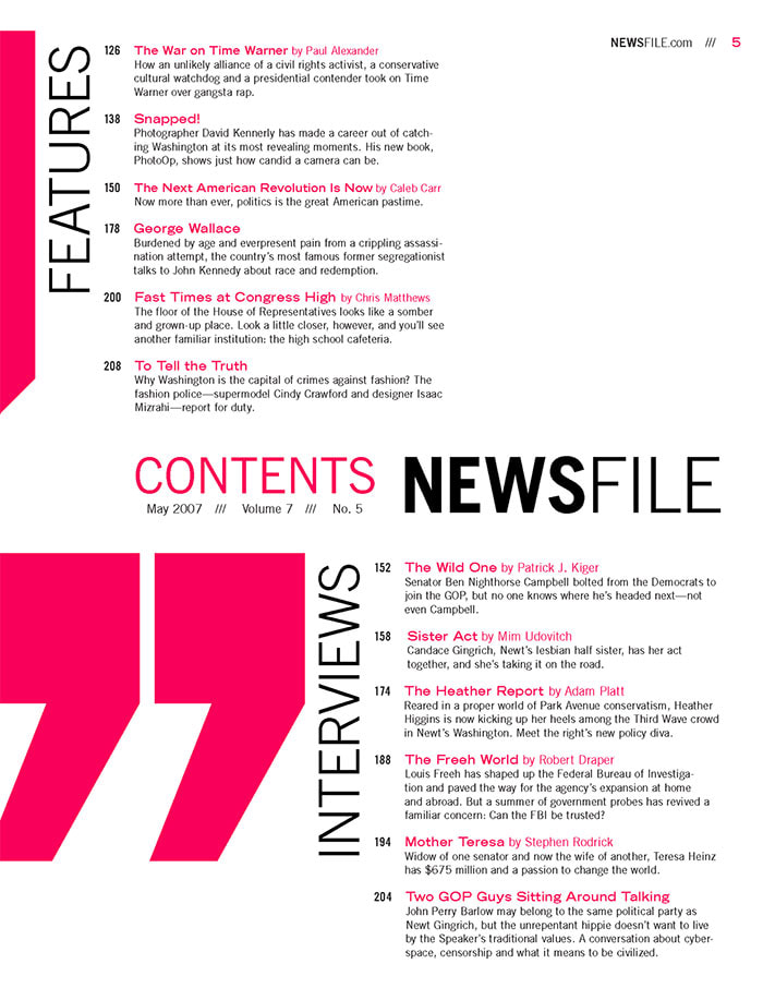
I enjoy this example because it includes multiple images relating to the magazine. I also can appreciate the little headings and descriptions for each of the ages. The images have the page number that they come from and its clean and organized. I think this could be a good starting point for my table of contents.
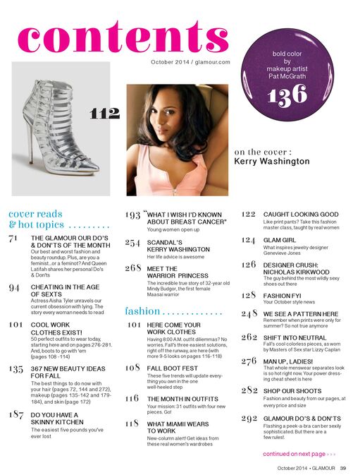
I really love the modern style of this table of contents layout, however, I think it will be difficult foe me to organize all of my content into tow categories. I dont necessarily need to make it divided into interviews and features, but it is a cool idea. I Am unsure about how i will be able to do real interviews with the famous musicians that i am featuring, my interviews will either be fake or based on real interviews that have already happened. This is just an idea but I do really enjoy the idea behind this, I am just not sure how i could execute it. I am confident that i can find other layouts that would work better with my front page.
|
I have come to the conclusion that the table of contents with pictures on them are the most appealing to me. I will, without a doubt, include pictures that are relate to my content in my table of contents and maybe even put a brief description with it. I like the that pages are categorized in this example and i think I will take ideas from each of these examples and incorporate them into my table of contents. It is important to me that it matches my theme and front page.
Here is my list of possible article topics: - Fleetwood Mac history and in band romances - Woodstock -Stevie Nicks solo career -70s hits -70s fashion and new technologies -Biggest artists of the time -inside interviews with Led Zeppelin and The Rolling Stones -Womens role in music and art |
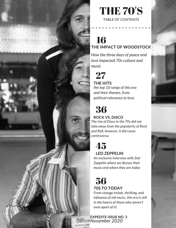
Table of contents
I thought it would be interesting and necessary to include a political aspect in my 70s magazine concept. From Disco vs. Rock and Roll, women's role in the music industry, to the Vietnam war. Artists often used their music to display their political views. The Vietnam war is relevent to my topic because it took place from 1955-1975 and by including this, I will be able to represent different social groups that were prominent at this time. For example, hippies and those who supported the war.
2. Although my magazine concept is looking to the past, I believe that I can modernize it enough to be relatable to my current audience. For example, discussing Led Zeppelin today and how 70s culture influenced todays music and fashion trends. Many young people today will be drawn to this topic because vintage is trending. I think this could easily be distributed as a real media text as long as it is portrayed to the right audience. I believe there that there will be many people interested in reading about the bands that are on their thrifted tshirts.
2. Although my magazine concept is looking to the past, I believe that I can modernize it enough to be relatable to my current audience. For example, discussing Led Zeppelin today and how 70s culture influenced todays music and fashion trends. Many young people today will be drawn to this topic because vintage is trending. I think this could easily be distributed as a real media text as long as it is portrayed to the right audience. I believe there that there will be many people interested in reading about the bands that are on their thrifted tshirts.
Media Studies Essay
The issues raised by media ownership and funding in contemporary media practice.
Typically, when we view different types of media, like movies, reality tv, or advertisements, we dont often consider media ownership or funding. However, these are two factors that can impact your perception of media, whether you realize it or not. Media ownership is everywhere, major conglomerates like Disney, news, and CBS own so many smaller companies that it is impossible to convey how much of media they actually control. This major spread of ownership allows these huge corporations to appeal to every type of audience possible. For example, you may say your not a disney person, however if you enjoy starwars, ABC, or Marvel...well, you are directly supporting and contributing to the Disney franchise.
This concept makes it difficult for viewers to escape these conglomerations. While making it even easier for these companies to capitalize and present their products through different media platforms. For example, Disney owns Lifetime, as well as ESPN. In order to thrive in multiple markets and to take advantage of their audience, ESPN will often air commercials promoting Lifetime movies. Some viewers may not be bothered by this, however, some may want to censor their media and don't want to be subtly influenced.
Another potential issue that media ownership presents is bias. The news corporation may take control of the information presented to the news watching audiences through bias. For example, the company could potentially revise information to hurt another parent company or intentionally leave out information to scew their audience. This media bias could potentially cause distrust between the viewers and their media sources. This occurs everywhere, not just television, but newspapers and online articles as well.
Even yet, some would argue that the prominence of these companies is beneficial to the viewers in some ways. Because of their widespread media, these companies are ridiculously rich and make money from each and every different sub media that they own. Because of this surplus of money, they have the resources ro make better content than independent groups with less funding. This is where the importance of funding comes in and why smaller organizations struggle to keep up. This should lead us to look more carefully at the types of platforms we put our money into and who owns them.
Media ownership and funding are not conepts that we often consider when enjoying out favorite media platforms. However, it is important to note that everything you view is filtered and has intention. These conglomerates use their platforms to their advantage and will attempt to make money off of you. There is heavy bias influence in the media and it may as well be impossible to escape it, however, keeping yourself educated and aware and holding companies accountable will take back some of your control.
Table of contents REVISION- Final Version
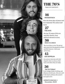
I made few changes to my original table of contents design. I looked into replacing the picture but I though that this one was a perfect fit. This time I noticed that they were holding an award and I wanted to highlight this instead of hide it. So, I moved all of my text and headings over onto the side of the page rather than gathered in the middle. Although I liked my previous design with the text box cutting off half of them, this change better highlights the image and still maintains the modern appeal. I also changed one of my headings to be more minimalistic and to the point.
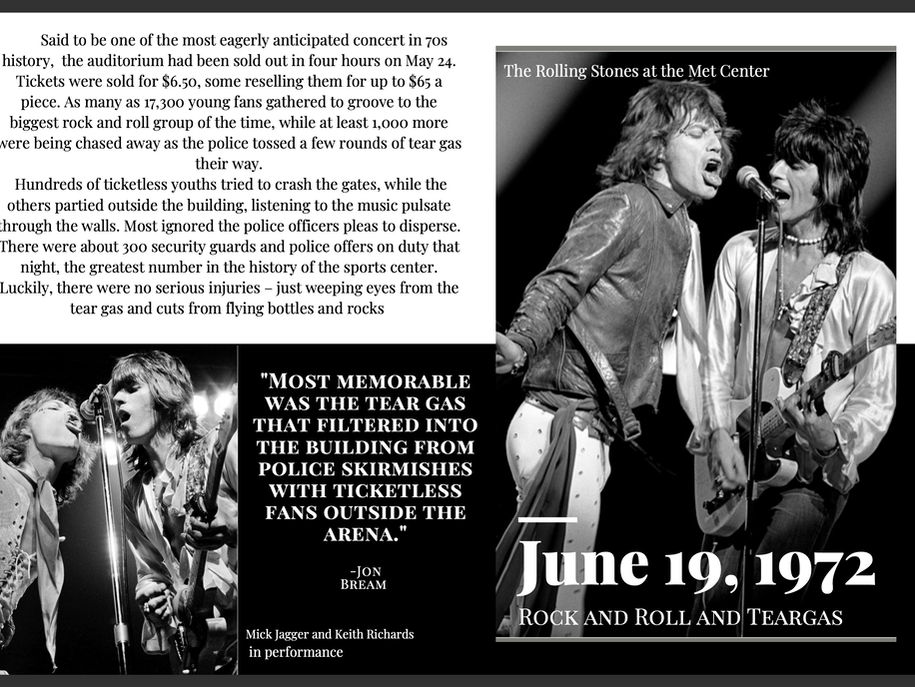
Double Page Spread- Final Version
Critical Reflection questions
https://prezi.com/view/vHODnnP5tCnDCqwgkTNI/
Please copy and paste link to see presentation.
Please copy and paste link to see presentation.
Magazine COver- Final Version